Developing and executing the perfect marketing strategy for your company is difficult. We are happy to give you a helping hand.
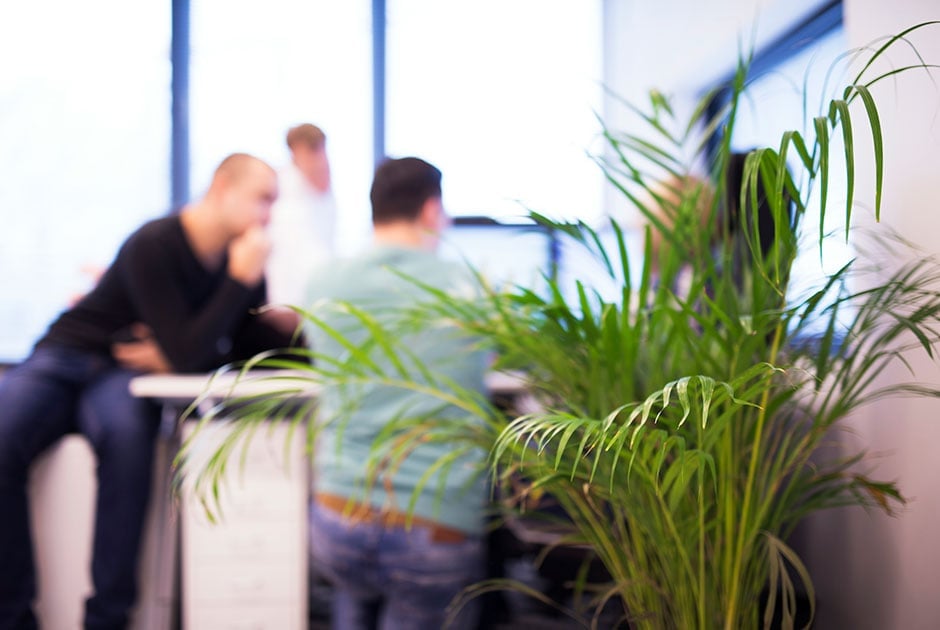
A close-knit group of people who breathe the Tilburg atmosphere and have the ambition to always go a step further.

Images make for an attractive website. They encourage visitors to take action. Since visitors judge within 7 seconds whether or not to stay on a website, it helps to draw them in with images.
As specialists in converting websites, we recommend that companies choose website images that fit the business and design.
2manydots creates websites suitable for retina screens. A whole host of Apple products take advantage of this. A retina-optimized website assesses whether, when displayed, the standard image is sufficient, or whether the extra-large version suitable for retina screens is required. This way the speed of the website is not compromised.
If you do not have a retina optimal website, you can choose to upload each image twice the size. The disadvantage is then that the image causes slow loading time on all other screens. You can also upload images at normal size, then you will have blurred images on retina screens.
Retina screens have twice as many pixels, making images appear sharper.
Header images are often page-wide. But keep in mind that visitors use different sizes of screens. What you want to prevent is an image becoming blurry because it is pulled apart due to being too small in size. Therefore, make sure you have a header image with a minimum width of 1920 pixels. Over 95 percent of Internet users have a screen of that width or narrower.
On many responsive websites, the header image of the desktop version is scaled to a smaller size to fit a mobile screen. As a result, images appear very small and prickly. In other cases, the image is cut out a piece(s). This means you have no control over the header displayed on smartphones. A good responsive website, therefore, offers the option of uploading a separate header for mobile users. That way you keep exact control over what you show.
A good responsive website, therefore, offers the option of uploading a separate header for mobile users.
Stock photos are the nail in the coffin of every website. A picture of smiling people around a conference table 200 meters above New York while you work in a modest office in Blaricum – no one will fall for that. If you want to use free imagery, choose suitable snapshots as well. Free royalty-free images can be found at:
You download the photos with a snap, but of course it is always better to use your own images. Therefore, the choice of free stock photos should be a temporary one.
If the web design assumes that the images should be landscape, it is very unwise to insert portrait images here. So either in the design phase make sure the design matches your image bank, or when creating an image bank make sure you photograph based on the web design. Your web designer can often specify what formats are used in the design.


