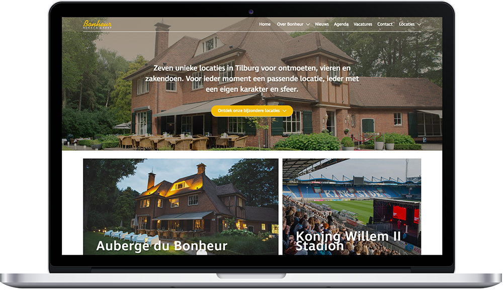

Developing and executing the perfect marketing strategy for your company is difficult. We are happy to give you a helping hand.

A close-knit group of people who breathe the Tilburg atmosphere and have the ambition to always go a step further.


With good web design, a website not only moves with the times. It also provides a better user experience. As specialists in websites that convert, we have seven tips that will make your website profitable.
In recent years, web design went in all directions. In the past, a design had to be mostly beautiful and lavish, with shadows, gradients and bordered frames. Nowadays, it is much more important for a design to be user-friendly. Minimalist designs make it easier for visitors to navigate a Web site.
If you follow the following eight rules when it comes to web design, the first step to an optimal user experience has already been taken.
The simpler the layout, the better your visitors’ experience. This does not have to mean that the website is boring to look at, you just keep the fuss away. By focusing on the absolute musts, the target audience will get a better idea of the services and/or products you provide.
A quiet design also has the advantage of loading faster, which benefits search results. Moreover, it comes out a lot better on different devices, such as cell phones and tablets.
Jan Abrahams’ portfolio website is a good example. No matter what page you land on, it’s immediately clear what kind of projects this landscaper is hot for. It is then easy to contact them directly using the buttons set up for that purpose.
The time visitors spend on your site and the amount of pages they visit counts for SEO. If a visitor is active on your site for a long time, it will find the information interesting.
To guide this process, you would do well to keep the navigation as simple as possible. One way to achieve this is to use a site-wide menu: you’ll find it on every page and it looks the same everywhere. Thus, visitors become familiar with the operation earlier and click through more easily.
A fast website is rated better by Google
You write stories, share blog posts, showcase your portfolio and have all services clearly displayed on the website. But what do you really want to accomplish with that when visitors land on these pages? Different pages serve different purposes. For example, on one page you want visitors to contact you and on another you want them to view previous projects.
Create appropriate buttons for these different purposes. You can incorporate these directly into the text and also place them at the bottom of the page. A combination is most appropriate for longer pages.

When you discover what your visitors need, try to put it online in the simplest possible terms. This does not require pieces of text. When you explain your work at a birthday, you don’t spend an hour either.
Let visitors focus on what you want to bring attention to. If a picture and two sentences will suffice, we heartily recommend not elaborating further than that. Add a call-to-action and you’re done.
The above applies to pages where you introduce your organization to the visitor. But when writing a search engine-friendly landing page or drafting a blog post, almost “the longer, the better” applies. Several studies show that Google prioritizes blog posts of roughly 2,000 words or longer in search results. By laying this out nicely with images, frames, quotes, headings and short paragraphs, you still hold the reader’s attention.
Don’t be afraid of blank lines. Make sure the website has some air in several places by not filling these spaces with text or an image. When you get this right, you increase online readability and also improve conversion. Think of Google’s home page: a white field with the logo at the top and a search bar below. That way your visitors don’t confuse you and do what you require of them.
Choose a color that matches your corporate identity and choose a contrasting color for things you want to stand out, such as buttons. You would do well to format all clickable items in the same color. This way, visitors know immediately where they can click and are also encouraged by this.
A well-written paragraph for mobile devices consists of no more than four sentences
With videos and smart graphics like infographics, you not only increase the number of visitors to your website; by doing so, you also make them stick around longer. And visitor duration, as we indicated earlier, is a factor that Google takes into account when assigning a ranking. So try to include your information in images from time to time. Or, better yet, make sure each article is interesting to both readers and “picture viewers.